|
For our last class of the term I wanted to do something really simple and enjoyable but I still wanted to make sure it was packed with some good art-theory! I decided that some good old Impressionist techniques would do the trick... but I really focused on creating tints here. Each child was given a pallet pallet with a few colours and white of course and we experimented with how adding different amounts of white changed the intensity of the colours! So they learned that the more white they added the lighter the colour became! This was so much fun and the plus side of course with all our art projects is they get a gorgeous piece of art to show off at home 😍
0 Comments
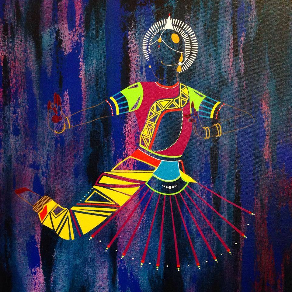
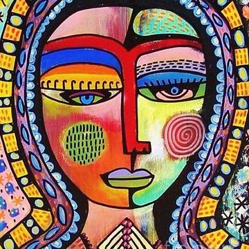
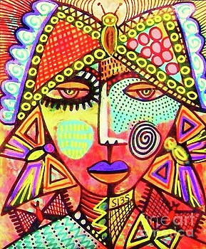
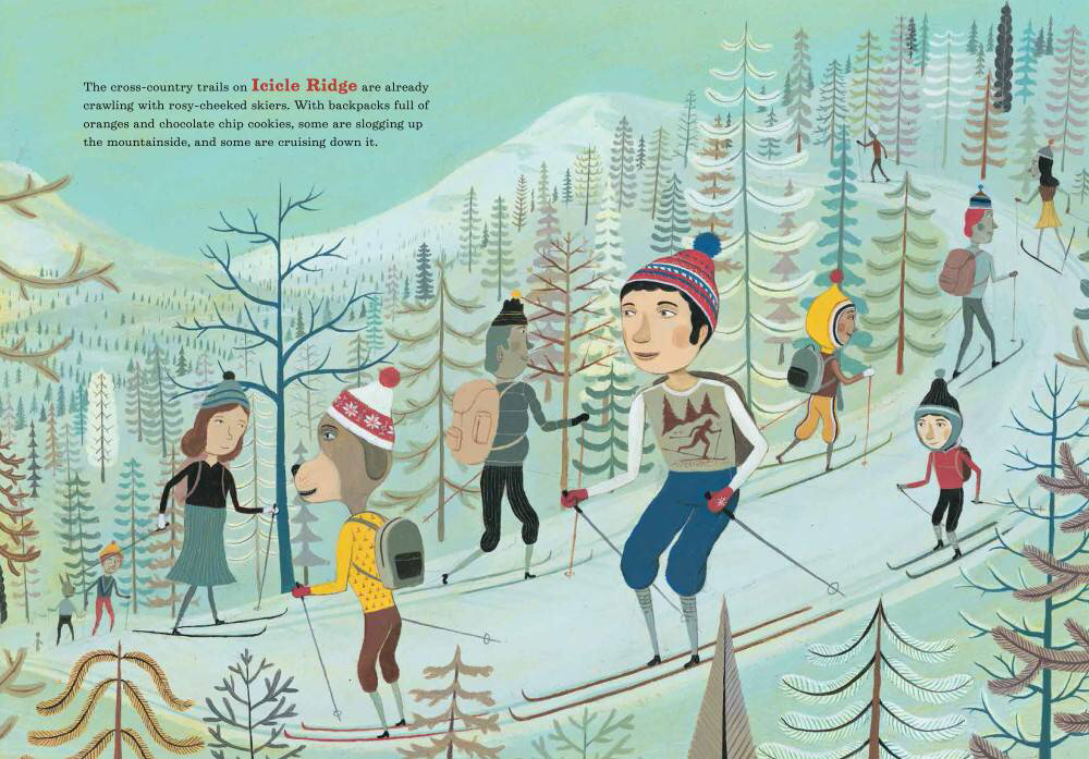 This week I thought we would shake things up a bit and paint a landscape that was totally unfamiliar! We talked about our weather and our seasons and the fact that at this very moment on the other side of the globe our friends and family might be bundled up under layers and layers of clothes and have to trudge out to work or school in heavy snow! Of course our art isn’t going to be dreary at all... the book Slush Mountain has some gorgeous illustrations that we took our inspiration from and the Picassos had such a great time creating a wintry scene! I also drew their attention to the difference between the trees we painted last week for our Poui Tree piece and these trees. So we discussed deciduous trees and evergreen trees and got a little science in the mix as well! In addition we got to talk about ATMOSPHERIC PERSPECTIVE, which is simply the use of colour to depict distance or space. So you'll notice that the trees that are in the distance are white, the ones in the middle ground are green and the ones closest to the viewer are the darkest! Sailboats make a great subject for art lessons. Their recognizable shape makes it easy to introduce many art techniques. For this lesson, our primary focus is a line drawing and color wheel exploration. To get started they had to draw out our scene, this means recognizing and making their shapes and getting them all in the right place. Then, the children were given an opportunity to paint shapes with the primary colors. Next came the part that always fills students with wonder: color mixing! They mixed secondary colors to fill in the rest of their artwork. Finally, we added the element of space with a simple horizon line and sun. Check out their lovely masterpieces! 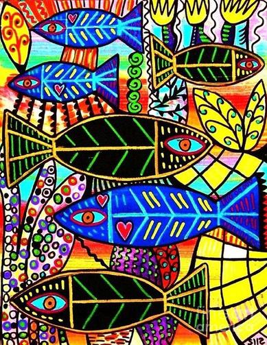 This lesson was inspired by artist Sandra Silberzweig. That's her piece in the picture. The main focus of this lesson is to teach children how to create tints and shades using tempera paint. But creating the tints and shades is quite easy, what is more difficult is establishing a prominent positive space with the fish. Especially when colours are everywhere... it's easy for a piece of art to get hard to look at it seems unsettling. To avoid this Silberzweig uses mostly cool colours on the fish and warm colours in the background. She also emphases unity and balance in the art piece by enforcing the RULE OF THREE... so there are 3 large fish and 3 smaller ones. Also the fishes are tied together using colour, whereas the background is multicoloured. Watch as the Warhols explore, line, shape, colour, movement and balance! A whole heap of Elements and Principles of Art to create some beautiful masterpieces. 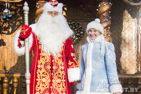 This year my Picassos and I did a bit of exploring! We looked at Christmas traditions around the world and we focused on Russia for our art piece! Children in Russia don't have Santa Claus... they have a similar figure called Grandfather Frost or Ded Moroz. He's actually tied more to winter than he is to Christmas. We learned that Christmas was banned in Russia from the early 1920s right up until 1991! During that time Christmas was celebrated by very few people and only in secret. Trees may have been put up but they were called New Year Trees, not Christmas Trees. Since Russians follow the Orthodox Church they celebrate Christmas on January 7th and Grandfather Frost dressed in either his elaborate red or blue coat grants children's wishes or brings presents. He also doesn't have reindeer... nope his sleigh is carried by 3 white horses that represent the three months of winter! After our very interesting discussion, the kids drew Grandfather Frost in an abstact style and we started painting him in using tints and shades of red, pink and orange. The focus here is using colour to demonstrate warm and cool colour pallets and how they can be used to make things either advance or recede. Divali is in the air and while the Hindu community is immersed in prayer and fasting, the rest of us can't wait to take in the colour, food and fashion that culminate on Divali day! When I first came across these Indian Dancers by local artist Danielle Rahael I was immediately drawn to them! I love her use of colour and her the fact that she stays true to her abstract style while also infusing our Trinidadian culture! Thanks Danielle for giving my Picassos such a fine example of how a local artist can interpret our life, our colours and our vibrancy into a style that is not always easy to digest. Check out my 7 to 11 year old Picassos as they try their hands at recreating an Indian Dancer in the style of Rahael in celebration of Divali! Our focus here was on colour. They took turns using the colour wheel to figure out their split complimentary colour scheme starting with the colour of their backgrounds. Then they drew and painted in Rahael’s signature style! Last week the Picassos started their abstract portraits inspired by contemporary artist Sandra Silberzweig and this week they're adding lots of colour, line and pattern to make those portraits really pop! They are also getting some practice using analagous (colours next to each other on the colour wheel) colour schemes and working with chalk pastels! To see the first part of this project -> Silberzweig Portraits  This week the Picassos looked at the work of contemporary artist Sandra Silberzweig (and incidentally learned that this just means she is still alive and creating art today, in our time). She's from Canada and loves to create colourful abstract portraits, but what's also very interesting about her is just like Kandinsky who we met last term, she also has the condition synesthesia! She wrote the following verse about how she experiences colour... I am a synesthesia goddess The children looked at some of her art pieces and we talked about how she uses the Elements of Art to enhance her creations! They got starting drawing out their abstract faces today and then outlining them with glue... next week they will add colour and pattern and complete their lovely designs!  The Christmas season is fully upon us so I thought it was time to bring some holiday cheer to our class! This week we looked at the work of the artist Kandinsky and infused his style with our Trini Christmas flavour! Kandisky is credited as the father of Abstract Art and he is also famous for having the condition SYNESTHESIA! Synesthesia means that colour and sound are inextricably connected in the brain, so a person with this condition can 'hear' colour and ascribes colour to music! It's no wonder then that his art came out looking the way it did! Putting Kandinsky and Parang together might seem an odd paring, but to me it seems quite natural and hopefully my Picassos left feeling the same way. They listened to a reading of The Noisy Paintbox which is based on the life of Kandinsky so they could appreciate the art and the artist we were going to try to mimic. To make sure my Picassos created something unique to them and something they could relate to, we talked about the instruments used in Parang. They practiced simple versions of them and then they came up with their compositions using Kandinsky as a guide! They had to be sure to use at least 3 instruments, make sure one pair is overlapping, then divide the background using irregular shapes! Lots of instructions to follow and I could just see the problem solving skills developing in this project! LOL They painted their compositions using a warm and cool colour combination... so yet another art concept comes into play!  There is nothing like the look of accomplishment on the face of a child when they do something and it comes out just the way they envisioned! This simple little drawing of Porky the Pig (I just had to name him guys 😀) delivers an easy win but it also works in lots of fundamentals. They have to use their shapes and follow instructions step by step and then of course they get to mix a tint! Red and white makes pink!!! Gasp! Finally I get them to say PERSPECTIVE and they learn that things look very different depending on which way you turn them! This piggy is viewed from the front, but if we drew him from the side it would be very different! Simple step by step drawings like these are real confidence builders for my little artists because they always start off thinking they can't draw whatever I say we're going to do, then voila they see that they can! Take a look at my darlings as they create the most adorable little pigs you've ever seen. 😉  |
Welcome!
Be a fly on the wall in our art room! Take a look at what we do, how we do it and the smiles that I get to see week after week :) Archives
February 2020
Categories
All
|


 RSS Feed
